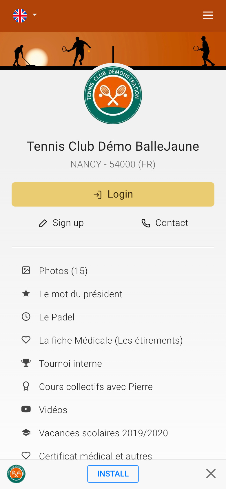
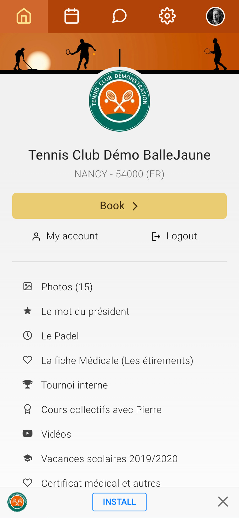
We have made a small modification to the homepage of your application on mobile.
Until now, the main call to action button was "Contact Us", it redirects to your contact page. This is useful, but we think it's more interesting to put forward the login and booking button to offer a faster access to these two elements to the user.
Now, when the visitor is not logged in, the "Contact Us" button becomes "Login" and provides easy access to the login form. The contact button is then displayed just below, to the right of the "Sign up" button if you have enabled this feature.
When the user is logged in, the action button becomes "Book" and allows access to the calendar with a single tap, whereas previously two taps were required to access them from the top menu.
| Before logging in : |
After login: |
|

|

|
The OpenResa team at your service!