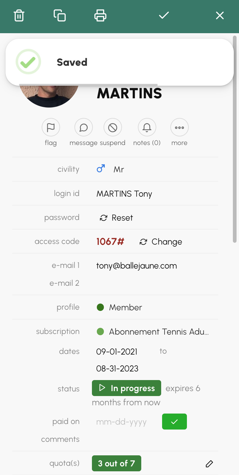
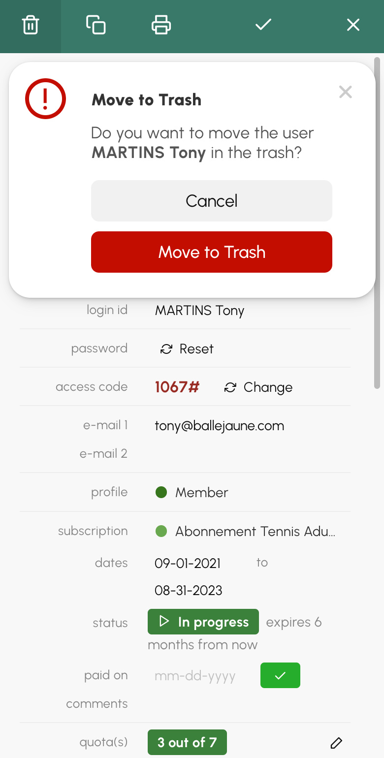
We've completely redesigned the messages that appear on your application's interface to inform you of the status of the operation you've just performed (success, error, warning), for example when you save changes to a user record or when you complete a reservation. This also applies to confirmation prompts, for example when you are about to delete an item.
This new design is intended to be more discreet and "floating" to appear on top of the interface without blocking the navigation. You have just successfully saved an item, the small bubble appears on top of the interface for three seconds and disappears automatically with a small progress bar indicating the remaining display time.
|
|
|
On mobile, the bubble messages appear in the upper part of the screen, below the main navigation, and its position can vary depending on the context. On the booking form or on sliding panels, the bubble appears in the immediate vicinity of the buttons and a simple tap anywhere on it makes it disappear.
 |
 |
The OpenResa team at your service!