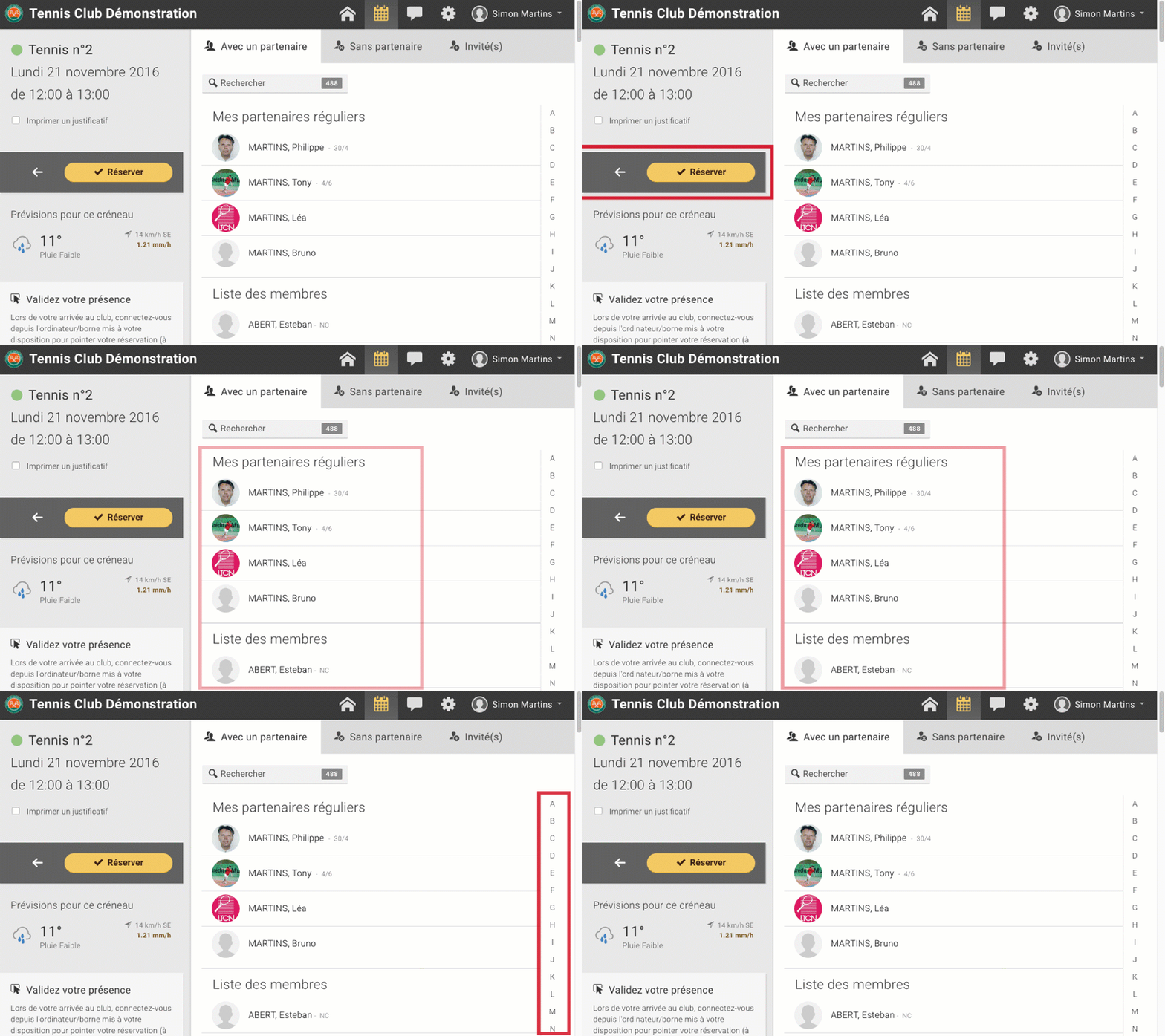
The booking form has been updated with several cosmetic changes. The users' pictures are bigger, the bar containing the buttons (back, validate) has been reworked and moved for a better ergonomics. On mobile, the choice of the type of reservation (with a partner, guest, labels, ...) has a new presentation for a faster selection.
On a computer or a tablet, the buttons are now located on the left below the slot summary. This move allows the buttons to be grouped together at a central point of the page, thus offering better ergonomics (it is no longer necessary to scroll through the entire screen to validate a reservation or return to the tables).

On mobile, the buttons are now permanently accessible in the lower part of the screen. It is no longer necessary to scroll to the top or bottom of the page to validate a reservation.
|
|
|
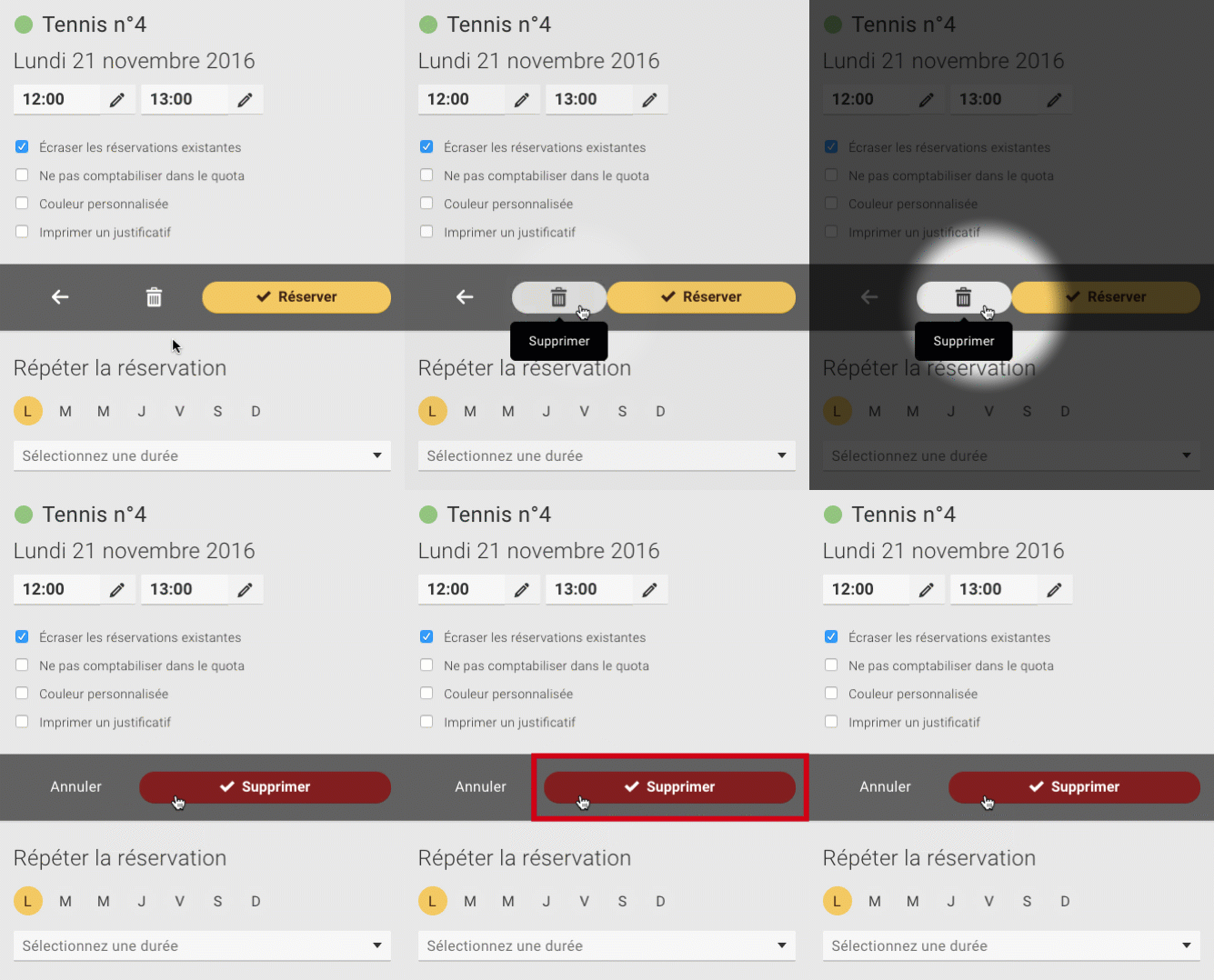
If you have the right to overwrite existing reservations you also have a delete button. This is now accessible in the middle of the new presentation, between the "Back" and "Book" buttons.
Click once on the icon to display the delete button:

The BalleJaune team at your service!