We have just updated your reservation tables! On the menu, many optimizations, some bugs fixed and several cosmetic changes. Here are some previews.
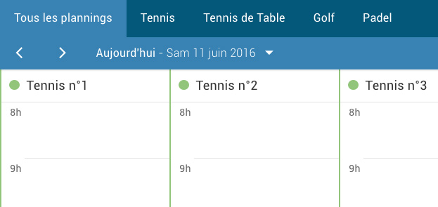
The tab system has been completely rewritten. The tabs now appear on the top left of the booking tables, on top of the logo and the club name. This change allows to recover some space in height.
In the day view, it is up to you to create tabs corresponding to your needs (by sport activity, by surface, by indoor/outdoor location, ...). You can use the tabs to group your schedules and access them more easily. Go to the menu Administration > Schedules > Tabbed navigation to configure tabs.
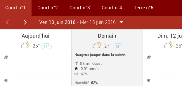
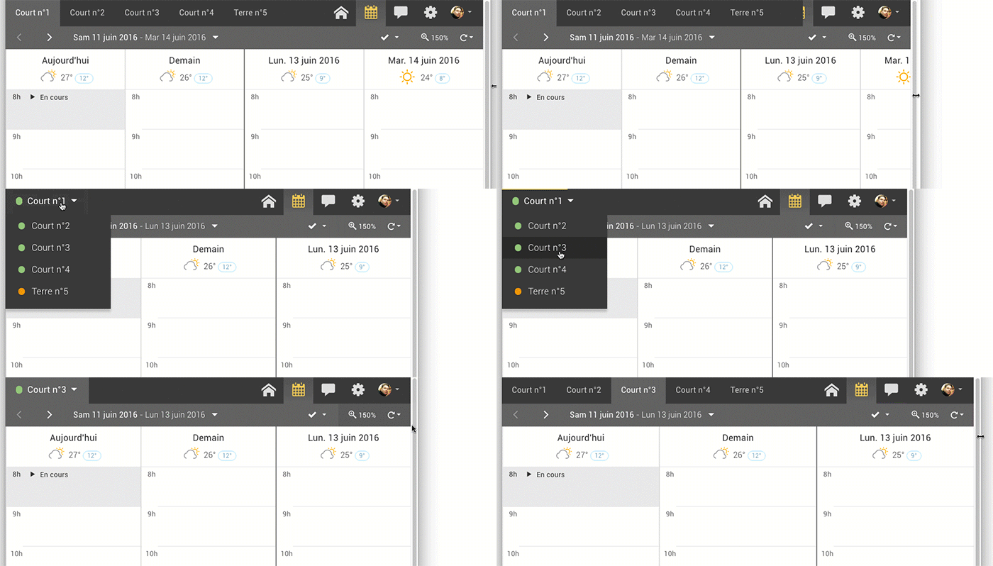
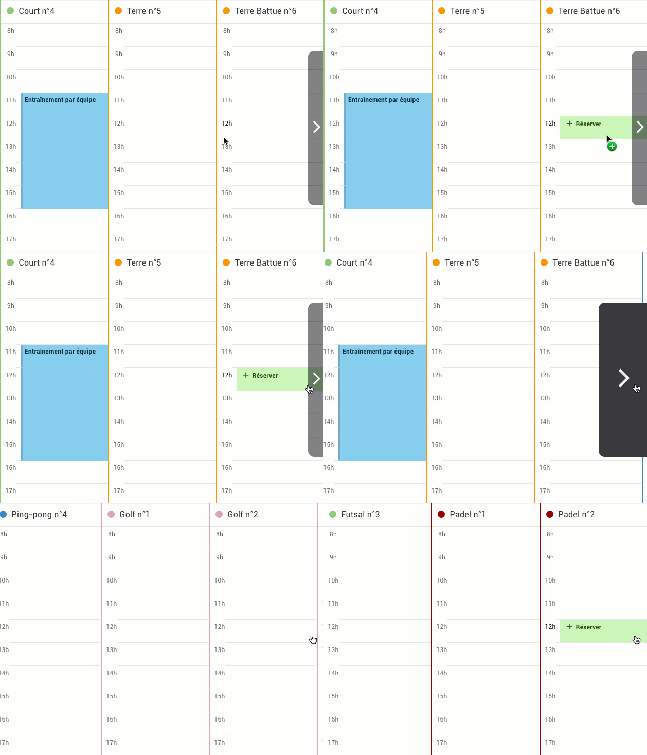
We have integrated the tab system in the "Tables by court" view, where until now a simple drop-down menu was proposed to select a court.
Our tab system adapts to the width of your screen / window. If this width does not allow the tabs to be displayed properly, they are replaced by a traditional drop-down menu.
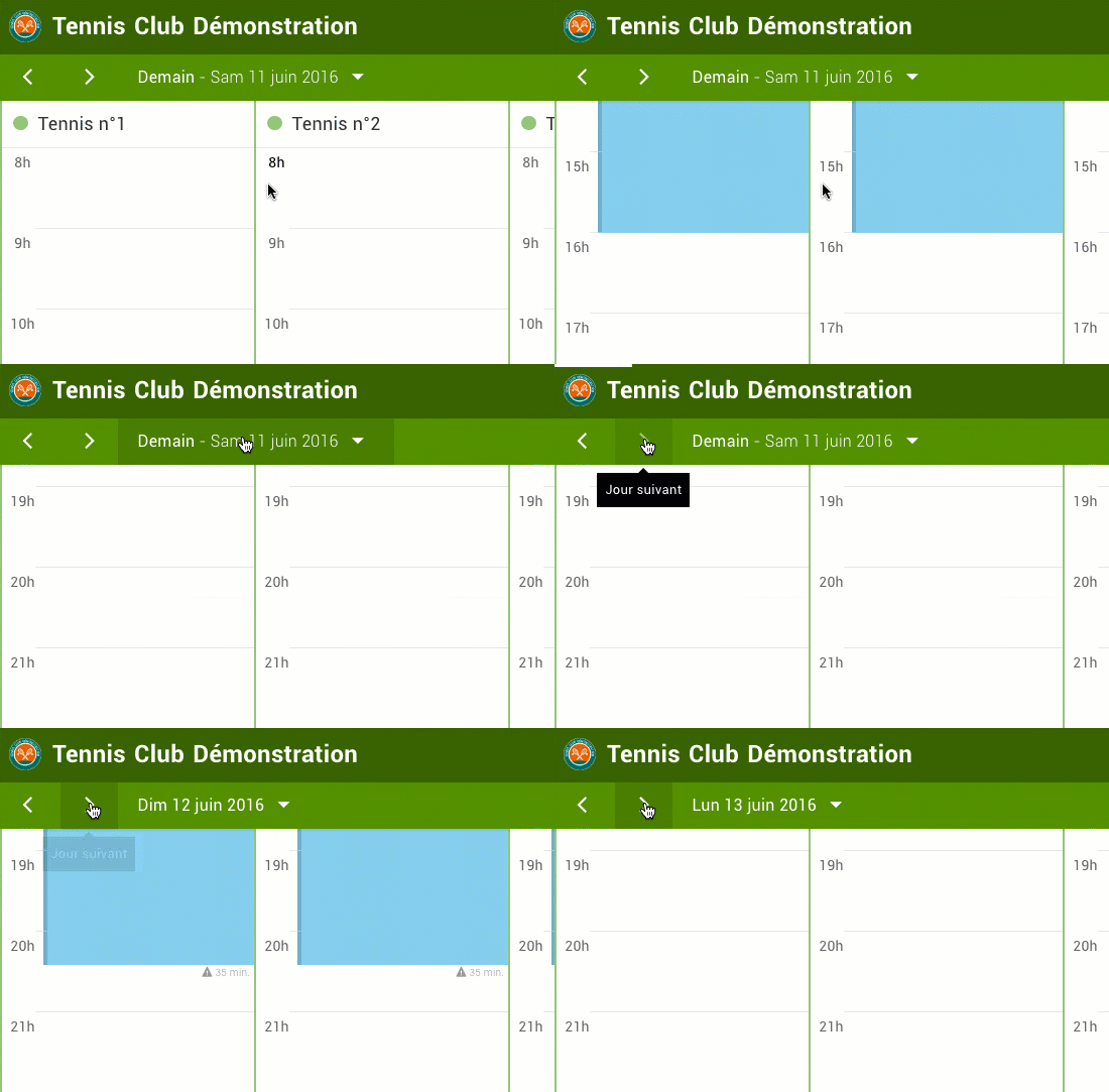
To start with, we have updated the main navigation bar: it now takes the color of the selected theme. Moreover, the navigation bar is now "fixed", meaning that it does not follow the scrolling of the page. This brings a significant comfort because you keep the date selector and the buttons to navigate in the days at your fingertips, even when you scroll the schedules at the bottom of the page.
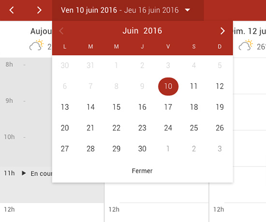
The date picker is useful to move through the schedules faster by selecting a specific date in a small calendar. We have improved the presentation of this calendar to offer you a more pleasant design with an increased readability. The contribution in terms of ergonomics will be even more noticeable on your touch screens (smartphone and tablet).
The buttons used to scroll through the schedules have been redesigned with a dark color that is easier to distinguish. Moreover, these buttons are now "fixed", meaning that they always remain visible on the screen even when scrolling the page.
We have also fixed a display bug on Internet Explorer 10 and 11 where the vertical scroll bar was preventing the navigation button from being properly reached.
The BalleJaune team is at your service!